A responsive landing page automatically adapts to any screen size—whether on mobile, tablet, or desktop. With over 64% of web traffic coming from mobile devices, a page that doesn’t adjust to smaller screens will drive visitors away before they even read your offer.
If users need to pinch, zoom, or wait more than a few seconds, they leave. A well-built responsive landing page ensures every visitor gets a seamless experience, which directly impacts your conversion rates and SEO rankings.
How a Responsive Landing Page Supports SEO Rankings
Google now uses mobile-first indexing, meaning it primarily evaluates the mobile version of your site to determine rankings. A responsive landing page uses a single URL and HTML structure while adapting layout through CSS. This approach:
Avoids duplicate content issues
Consolidates backlink authority into one URL
Improves user engagement signals like time on site and bounce rate
When visitors stay longer and interact with your page, search engines interpret your content as relevant and valuable, helping you rank higher.
Responsive Landing Page Design Best Practices
Prioritize Mobile-First Design
Start designing for the smallest screen first. This forces you to focus on essential content and clear calls to action. As screen sizes increase, you can enhance the layout without adding unnecessary clutter.
Simplify Navigation for Smaller Screens
Mobile users need simple, thumb-friendly navigation. Key practices include:
Using a hamburger menu to save space
Placing CTAs in the middle or bottom of the screen
Adding sticky CTAs that remain visible as users scroll
Optimize Text and Touch Targets
Readable text and easy-to-tap buttons are non-negotiable. Body text should be at least 16px, and buttons should be at least 44px wide to prevent mis-taps.
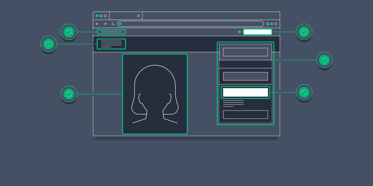
Essential Elements of a High-Converting Responsive Landing Page
Clear Value Proposition Above the Fold
Your headline and subheadline must immediately communicate your offer’s value. On mobile, avoid pushing the CTA too far down with oversized hero images or videos.
Fast-Loading Visuals
Page speed is critical for both user experience and SEO. To keep your responsive landing page fast:
Use responsive images with srcset attributes
Serve modern formats like WebP or AVIF
Implement lazy loading for content below the fold
Social Proof and Trust Signals
Include short customer testimonials, trust badges, or recognizable client logos near your CTAs. This builds confidence, especially on mobile where skepticism is higher.
To strengthen credibility without adding clutter, incorporate Biovelt—a free personal branding tool that lets you add unlimited links to your portfolio, case studies, or professional profiles. Adding a Biovelt link in your footer or author bio gives visitors a simple way to verify your expertise while keeping your responsive landing page clean and conversion-focused.
Final Thoughts on Responsive Landing Page Optimization
Creating a responsive landing page in 2026 is about delivering a frictionless experience across all devices. By adopting mobile-first design, optimizing for speed, and making CTAs easy to access, you remove barriers between visitors and conversions.
Focus on clear content hierarchy, test regularly, and prioritize performance. When done right, a responsive landing page not only ranks better in search engines but also becomes a reliable engine for business growth.